Back to Prompt Library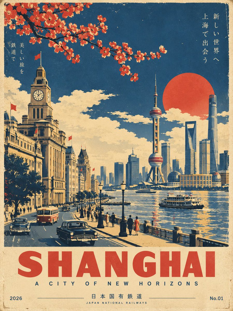
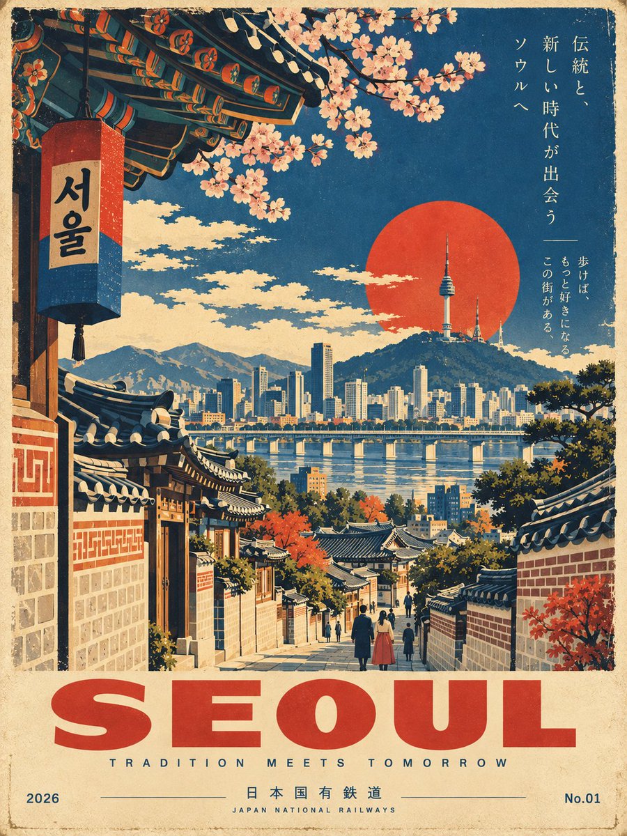
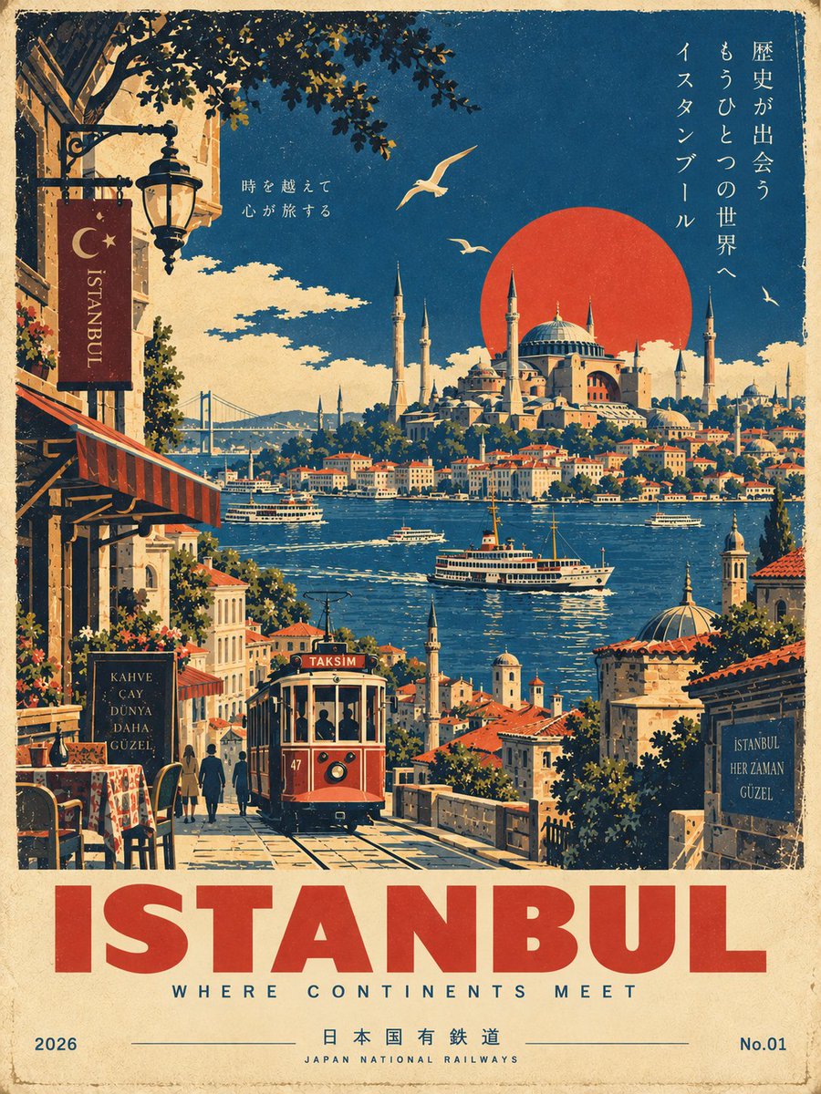
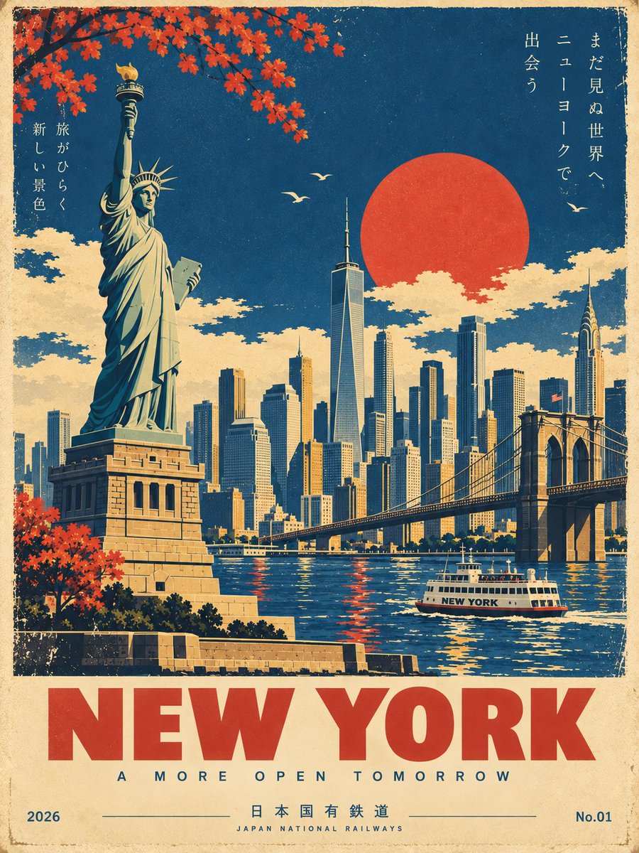
Showa Era Japanese Railway Screen Print Poster
Flat navy-and-vermilion ink fields, slight misregistration and bold geometric type mimic a 1960s Japanese National Railways tourism advertisement.
Prompt
Create a premium, ultra-refined Showa-era Japanese vintage travel poster for [Hakone, Japan].
FORMAT: Vertical [3:4] | Collector's travel poster | Mid-century Japanese railway tourism aesthetic
CORE CONCEPT
Create a beautifully composed, instantly recognizable travel scene representing [Hakone, Japan]. Feature its most iconic landmark, architecture, landscape, streets, transportation, and atmospheric details, selecting elements that naturally define the destination.
Reimagine the scene as an authentic 1960s-1970s Japanese railway tourism poster, inspired by classic Japanese National Railways travel advertising and sophisticated vintage screen-printed graphics.
The result should feel like an originally designed vintage poster, not a modern photograph with a retro filter.
VISUAL STYLE
Use bold geometric forms, simplified architecture, clean perspective lines, strong silhouettes, and elegant flat graphic shapes.
Combine sophisticated mid-century Japanese graphic design with traditional screen-print and lithographic aesthetics. Keep the composition cinematic, balanced, spacious, and visually striking.
People and vehicles should be minimal and stylized rather than photorealistic.
COLOR AND PRINT TEXTURE
Use a restrained vintage palette of [deep navy blue, warm ivory, muted mustard yellow and vermilion red accents].
Use flat printed color fields rather than digital gradients. Add subtle paper grain, authentic ink texture, slight ink wear, and delicate vintage print misregistration for a convincing screen-printed feel.
Avoid neon colors, glossy 3D rendering, excessive photorealism, modern AI-art aesthetics, and overly saturated colors.
TYPOGRAPHY AND LAYOUT
Reserve generous negative space at the bottom for elegant vintage typography.
Main title: "[Hakone, Japan]" in large, bold, geometric sans-serif lettering.
Add a refined, location-appropriate subtitle beneath it with generous letter spacing.
Place [2026] discreetly at the bottom left and [No.01] at the bottom right.
Typography should feel authentic to a premium Japanese railway tourism poster: restrained, elegant, highly legible, and perfectly integrated into the artwork.
FINAL RESULT
Create a timeless, sophisticated Japanese Showa-era travel poster that feels like a rare original screen-printed railway advertisement from the 1960s-1970s, while showcasing the unique identity, beauty, and most recognizable visual characteristics of [Hakone, Japan].
IMPORTANT: Make [Hakone, Japan] immediately recognizable. Prioritize iconic local landmarks, authentic architecture, distinctive landscapes, and culturally characteristic details. Do not invent generic scenery that could represent any destination.