Back to Prompt Library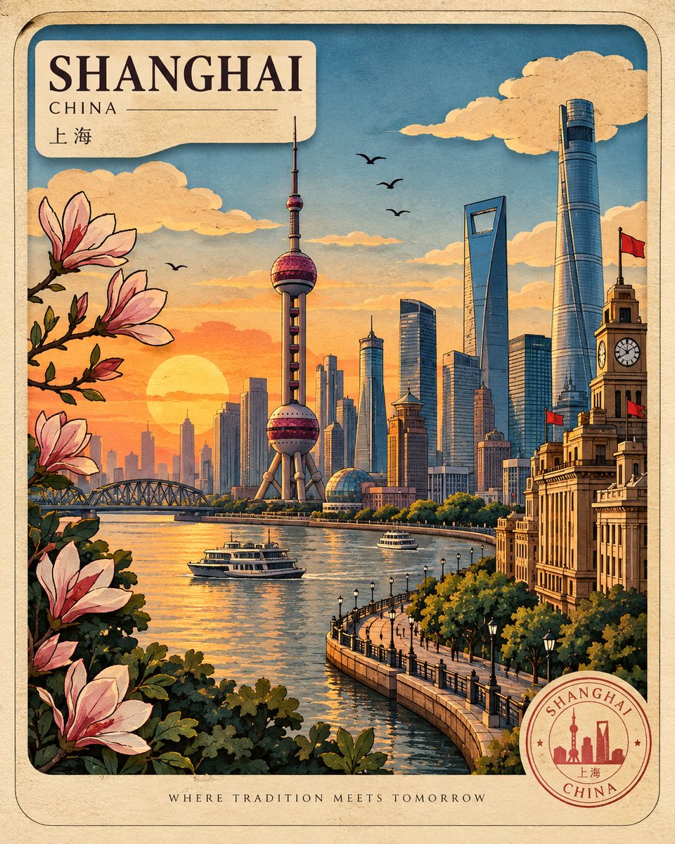
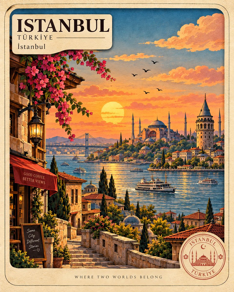
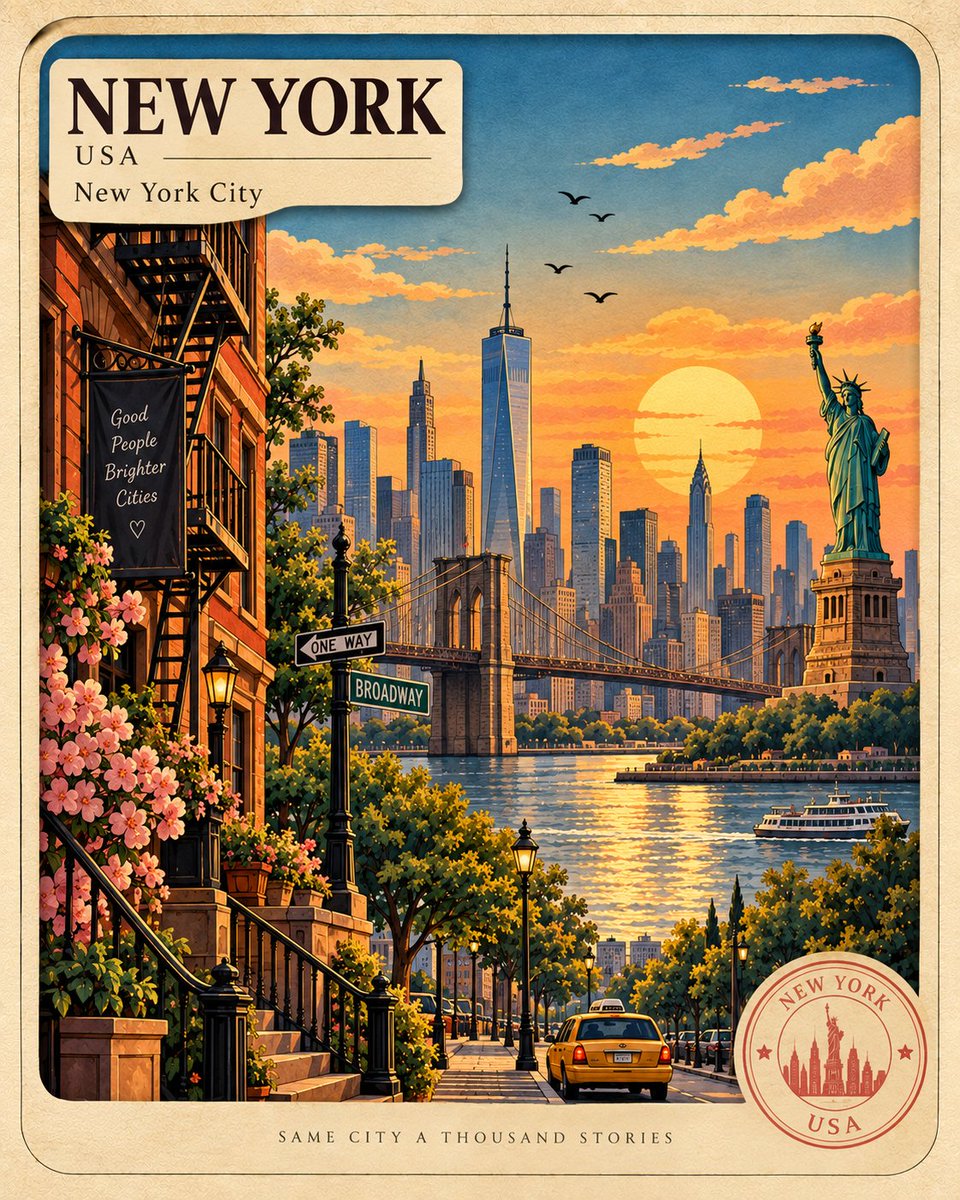
Cut Paper Layered Travel Postcard Poster
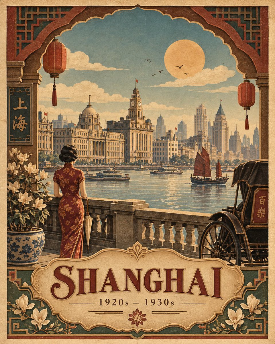
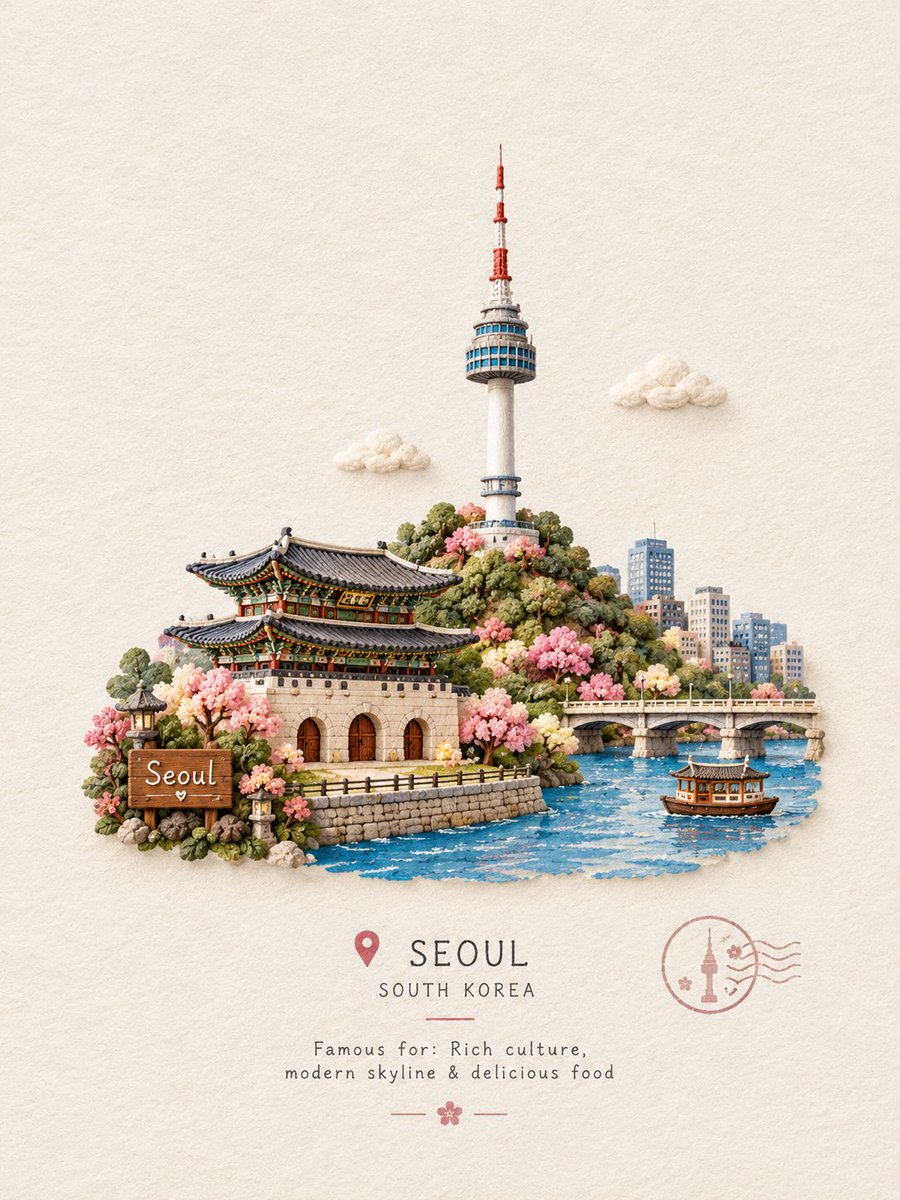
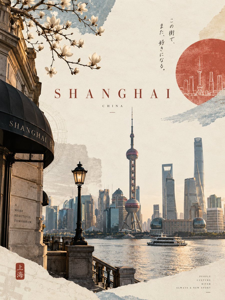
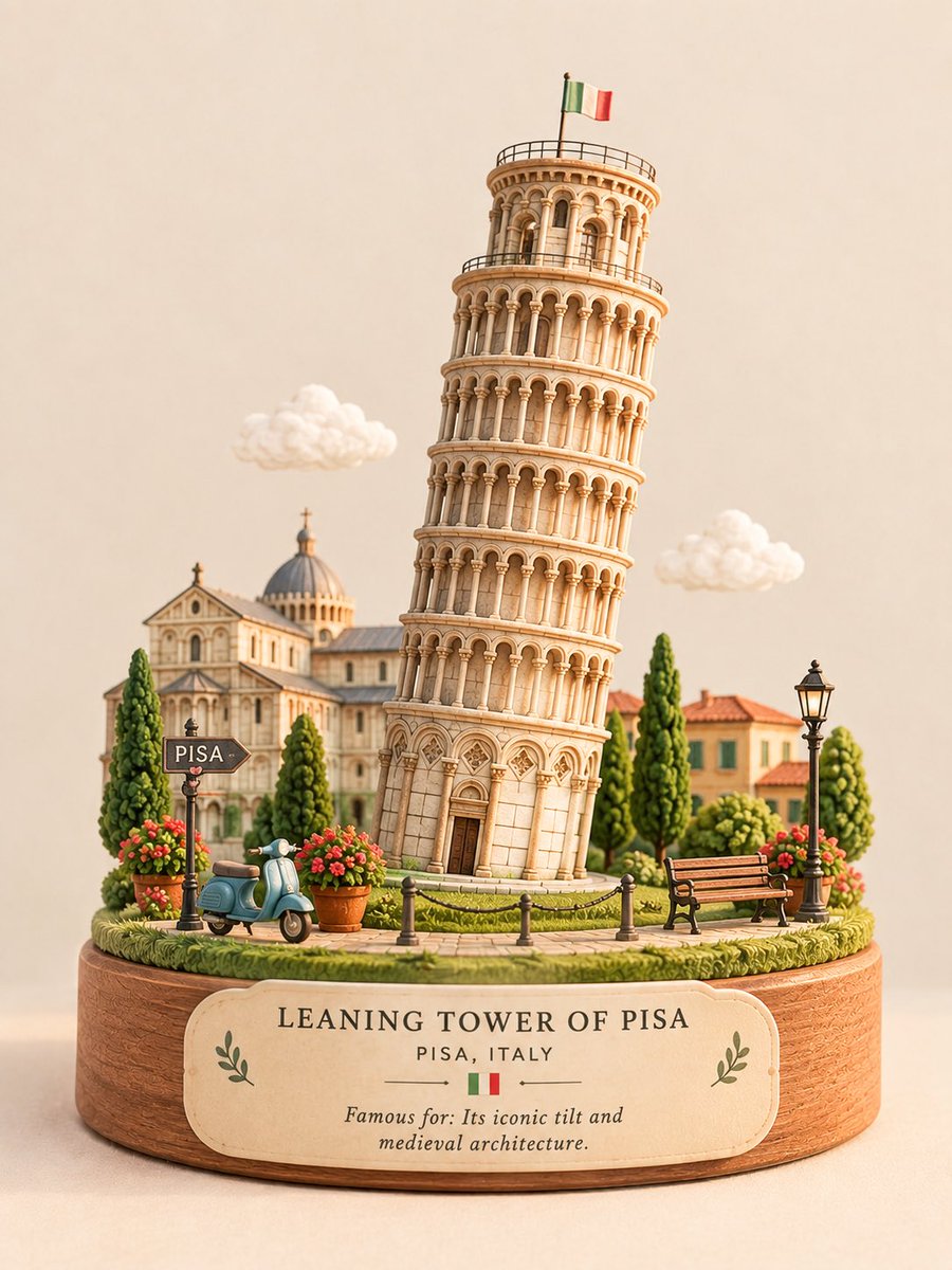
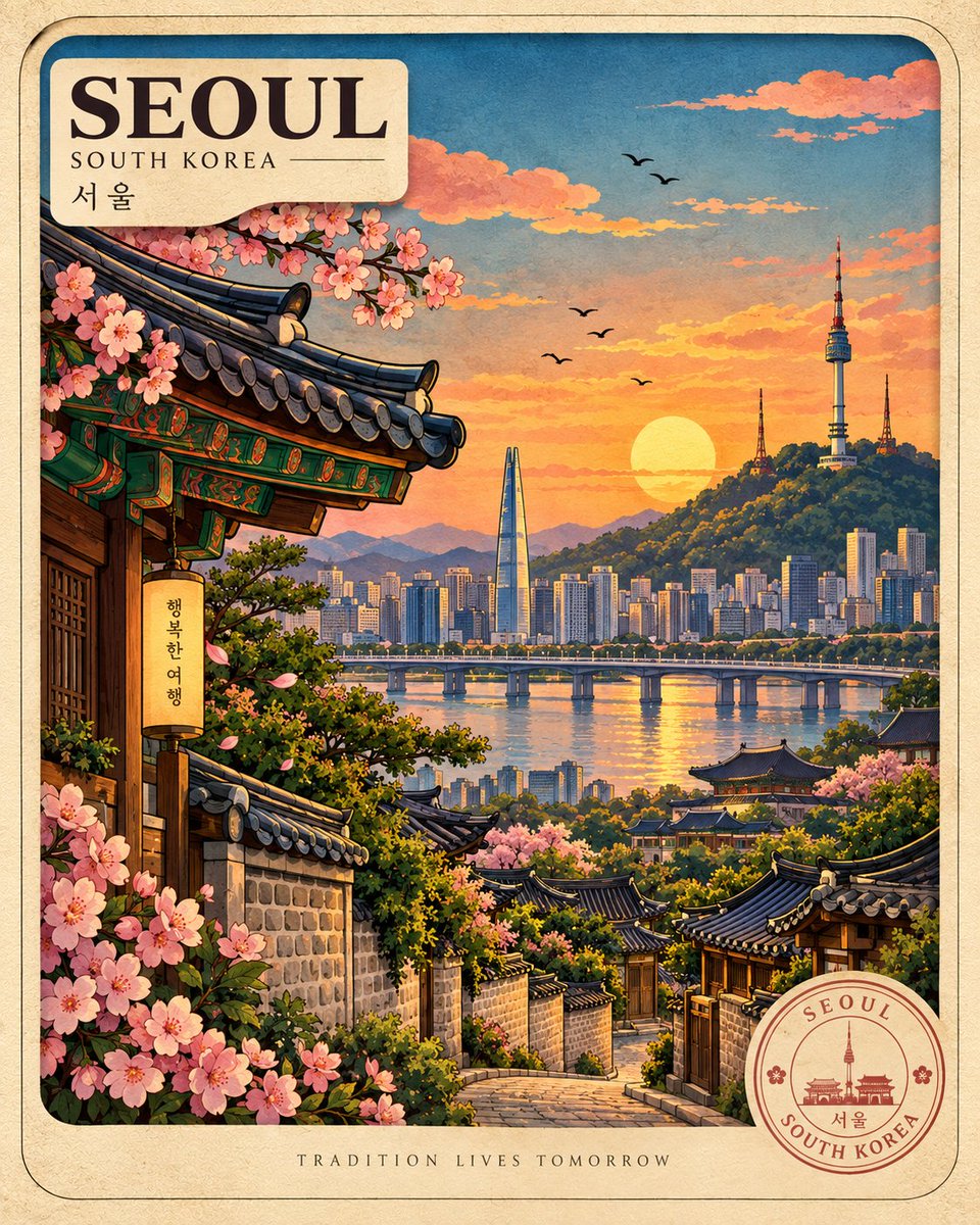
Cut-paper layers, bold black outlines and golden-hour color stack a destination into a rounded postcard frame that belongs to one unified poster series.
Prompt
Create a premium vertical 4:5 travel-poster illustration of [Kyoto, Japan], following a consistent handcrafted visual identity: bold, clean black outlines, saturated yet harmonious colors, warm golden-hour lighting, richly textured paper/cardstock surfaces, layered cut-paper depth with soft cast shadows, a rounded vintage postcard frame, and a charming illustrated (not photorealistic) finish.
Build a strong cinematic depth hierarchy with destination-specific foreground foliage or details, then a winding road, path, or river leading inward, then iconic local architecture and cultural elements, then layered surrounding landscapes, and finally an atmospheric sky with stylized clouds, sun, and birds. Use 3-5 tactile paper layers with subtle raised or embossed edges, selective handmade imperfections, and one distinctive local material texture, [washi paper], used naturally and without overpowering the artwork.
Make the location instantly recognizable through 3-5 authentic landmarks or place-defining elements, while keeping the composition uncluttered. Use one dominant focal point, strong thumbnail readability, generous negative space, and a clear visual journey from foreground to background.
Maintain a cohesive global series system: cream textured border, top-left destination identity panel, bottom-right circular destination seal, and a short evocative travel phrase at the bottom center reading [Where Time Slows Down], with consistent typography, spacing, and graphic language. Keep text minimal and refined.
Avoid photorealism, generic tourism imagery, excessive 3D effects, visual clutter, and random objects. The final artwork should feel like a collectible handcrafted vintage travel postcard from one sophisticated, unified global art series.