Back to Prompt Library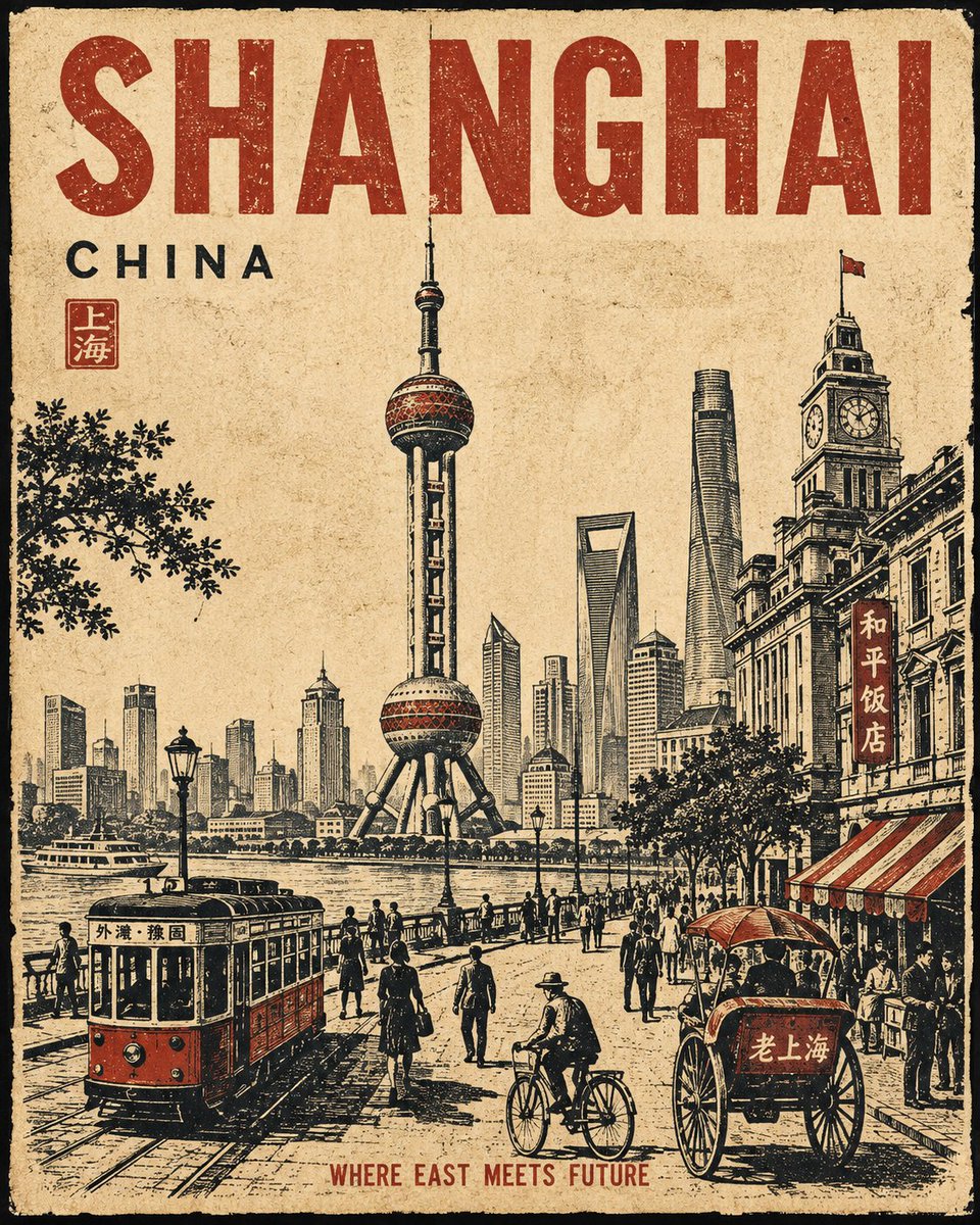
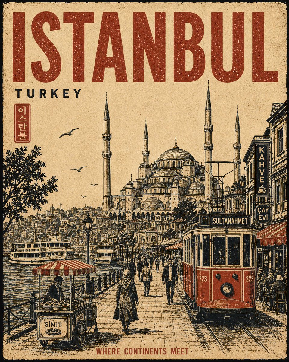
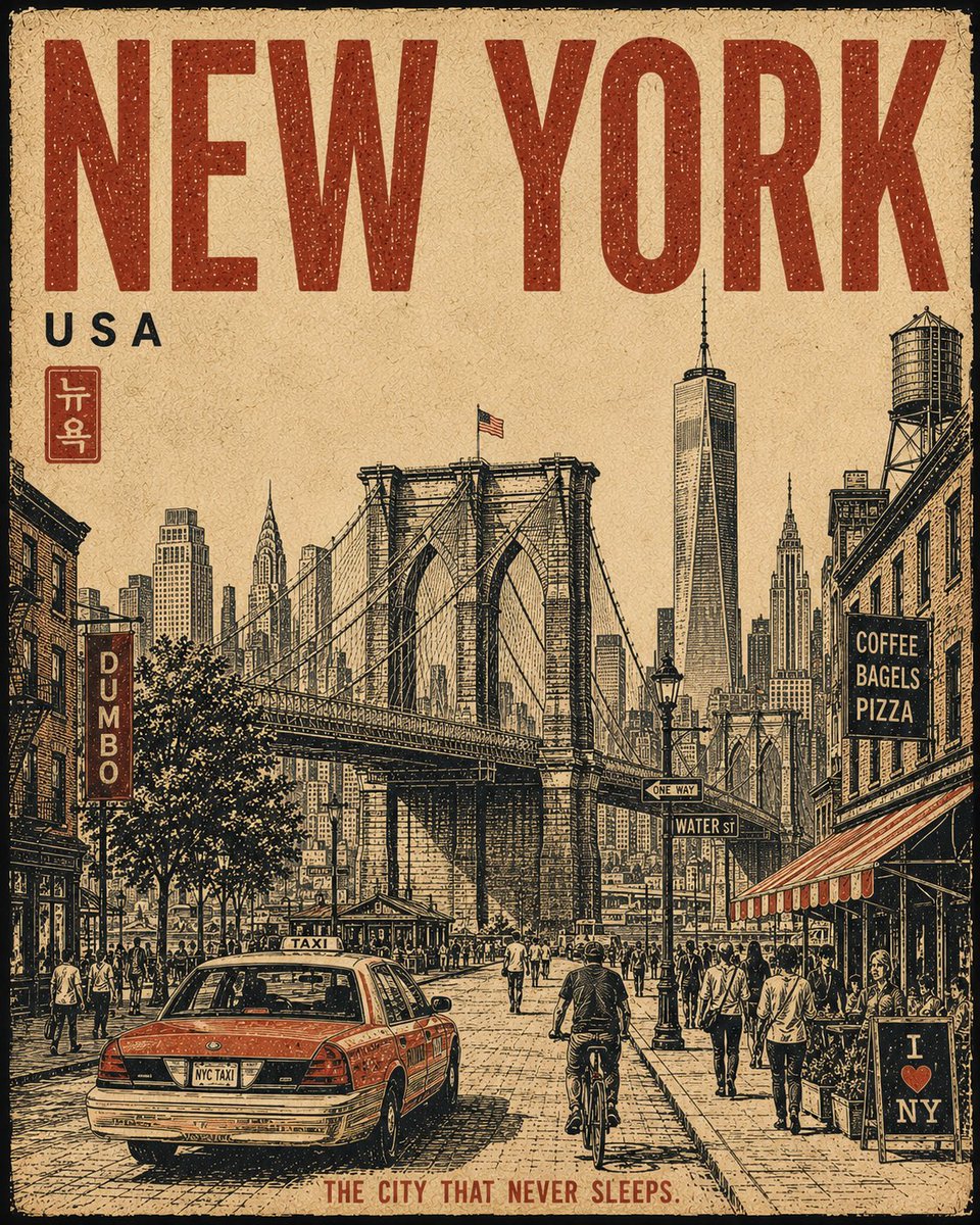
Linocut Screen Print City Poster Series
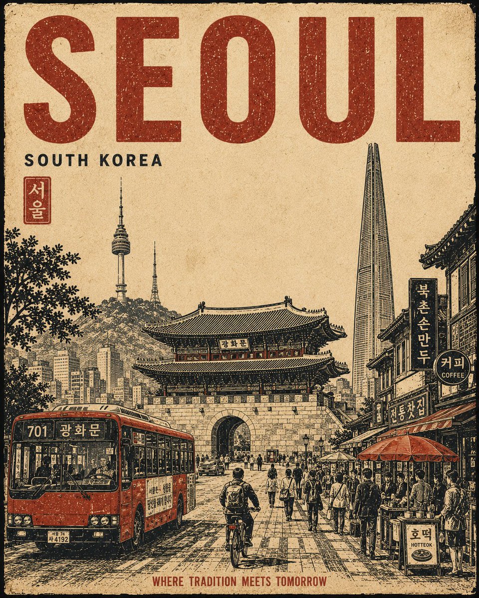
A locked template for a repeatable poster series: one street-level scene, three colours only, carved silhouettes and deliberately misregistered distressed ink.
Prompt
Create a premium 4:5 vertical vintage travel poster for [Prague], [Czechia]. Follow the same visual structure, composition, proportions and artistic treatment in every generation, so the result feels like part of one consistent collectible poster series.
FIXED COMPOSITION
Use a single unified street-level scene, not a collage. Place one dominant central architectural or cultural subject as the visual anchor, occupying roughly 50-60% of the central image area. Integrate two to four recognizable city landmarks or architectural details naturally into the same environment, with clear foreground, middle-ground and background depth. Never make landmarks appear as floating objects or separate illustrations. Add subtle authentic city-life elements around the main subject: characteristic transportation, streets, buildings, cafés, shops, signs, pedestrians, cyclists, local objects, food, trees and surrounding landscape. Only include details that genuinely belong to this city.
FIXED LAYOUT
Keep generous negative space around the main subject and maintain a strong hierarchy: CITY NAME then MAIN SUBJECT then SUPPORTING CITY DETAILS then SMALL SECONDARY TEXT. Do not change the placement or scale relationship between these elements between generations.
FIXED MATERIAL & COLOUR
Use an aged warm-ivory paper background with visible fibres, subtle stains, faded areas, rough edges and authentic printed-paper texture. Use only three dominant colours: warm ivory, charcoal-black and one signature accent colour, [deep crimson]. The accent must remain selective and never dominate the image.
FIXED ART STYLE
Handmade vintage linocut plus screen-print travel poster. Bold carved shapes, strong silhouettes, limited-colour printing, rough ink texture, distressed halftone grain, slight ink misregistration, imperfect hand-cut edges, subtle fading, expressive perspective and sophisticated editorial composition. Keep the artwork intentionally tactile and slightly imperfect.
TYPOGRAPHY
Integrate "[Prague]" as large, bold, hand-printed typography in a consistent prominent position. Add "[CITY OF A HUNDRED SPIRES]" as smaller secondary text. Typography must look physically printed into the artwork: slightly distressed, imperfect and naturally integrated. Keep the wording exactly as provided and do not invent additional text.
DO NOT
Do not use photorealism, glossy 3D rendering, gradients, excessive colours, modern digital effects, random landmarks, floating objects, tourist-collage layouts, excessive text or ultra-clean vector graphics. Do not change the established composition, palette, typography hierarchy or artistic style.
FINAL GOAL
A bold, sophisticated, culturally authentic vintage collectible travel print with one continuous visual story, looking like a carefully screen-printed European travel poster from an established design series while remaining uniquely recognizable as this city.