Back to Prompt Library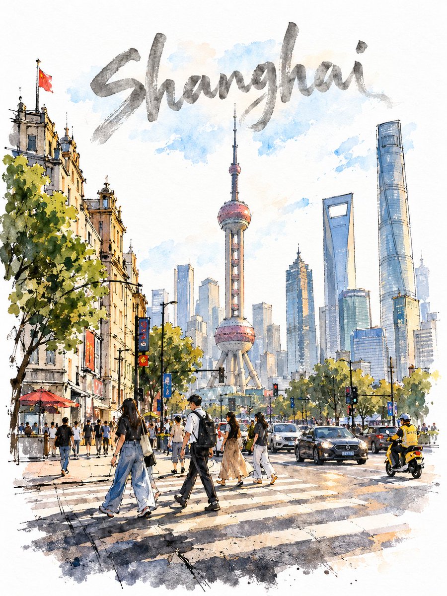
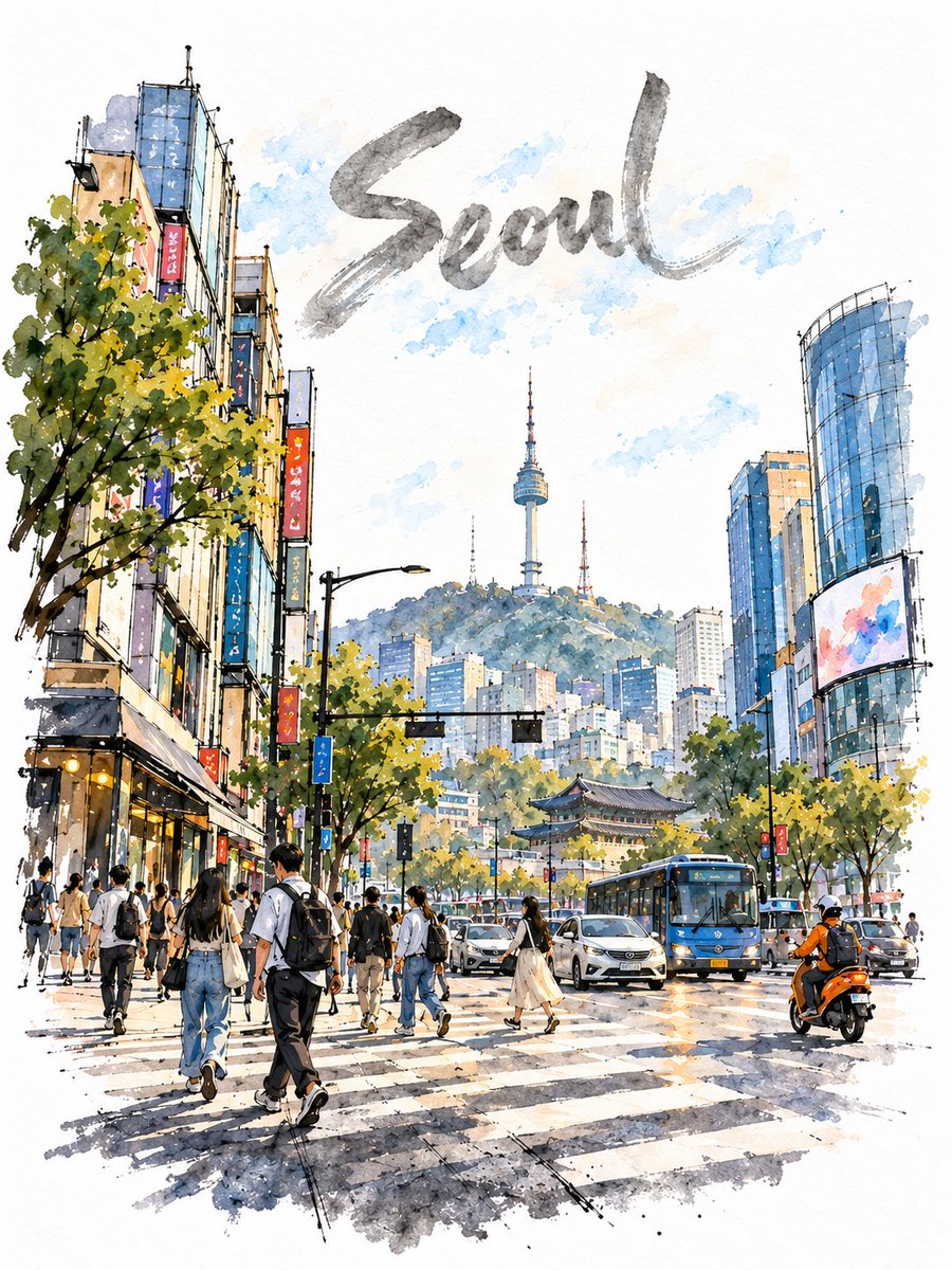
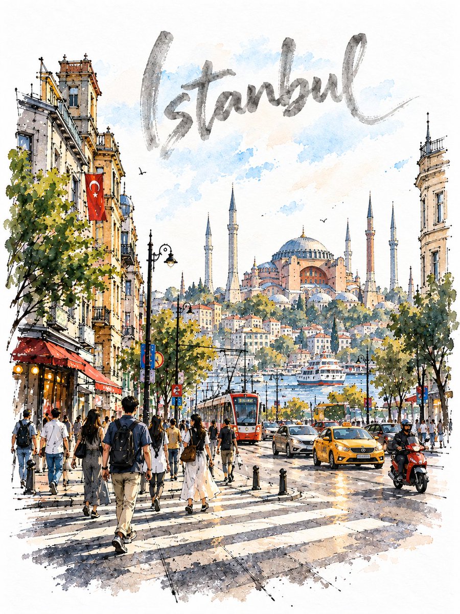
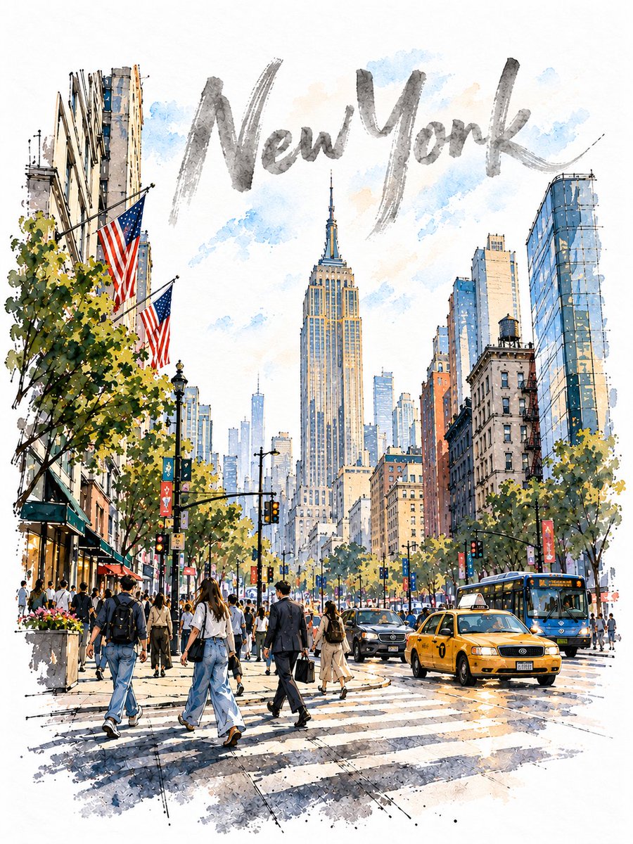
Loose Urban Sketch Watercolour Street Crossing
Wobbly fineliner lines, wet-in-wet blooms and untouched white paper build a busy crossing, with the city name hand-lettered across an open watercolour sky.
Prompt
Create a loose urban-sketch watercolour of a busy street crossing in [Tokyo], vertical 3:4, on pure bright-white cold-press paper with visible texture. No cream, beige, sepia, or vintage tint.
TITLE: Paint only the city name across the empty upper sky in large expressive hand-lettering. Use translucent warm-grey watercolour with varied brush weight, darker pooling, dry-brush gaps, an irregular baseline, and slight tonal fade. It must look hand-painted with the same brush as the artwork, never printed or pasted. Add a subtle pale blue/apricot wash behind it, fading before the edges.
SCENE: Low-angle pavement view of a wide multi-lane crossing. Make [a tall glass office tower] the dominant middle-distance landmark, with a distinct low brick retail block on the left, a slim concrete apartment building on the right, and smaller pale mid-rise offices in the far distance. Include [a city bus], a few sedans, and one small [red taxi]. Keep buildings clearly different in height, material, and colour.
LINEWORK: Rough black fineliner drawn first: loose, wobbly, broken freehand strokes, imperfect perspective, occasional overshoots, and minimal single-direction hatching. No perfectly ruled lines.
DEPTH: Strong density gradient. Foreground is about 60% resolved and colourful; mid-ground about 30% with softened edges; distance about 10%, mostly pale outlines and washes. Leave some distant buildings unpainted. The outer 20% of every edge and all four corners must remain untouched white paper. Never create an even wash or vignette.
ARCHITECTURE: Avoid complete window grids. The hero building gets only a few broken mullion lines with large areas of wash-only glass. Its glass reflects broad sky-blue and white-paper sweeps, warm apricot sunlight, and only two soft warped building reflections.
PEOPLE: 10-12 figures scattered across near, middle, and far distances. Vary size, spacing, overlap, poses, and activities. Use tiny loose ink marks for distant figures; minimal facial detail; soft grey contact shadows; let some outlines dissolve into the washes.
GROUND: Darker visual weight in the bottom fifth: near kerb, sparse pavement joints, grit, and a cast shadow toward the viewer. Paint only portions of the crosswalk, leaving large areas of white paper.
COLOUR & LIGHT: Loose off-register watercolour over ink with wet-in-wet blooms, backruns, hard edges, and dry-brush skips. Use [warm ochre] for sunlit architecture and pavement, muted sage for trees, and cerulean for sky and glass. At least four distinct hues; no hue dominates. The accent vehicle is a tiny accent under 3%. White paper is the brightest value. Keep only 4-5 small deepest-value accents.
SKY & TREES: Mostly white sky with sparse broken blue strokes. Trees appear in separated clusters with wide white gaps; vary their size and treatment, including one large cropped foreground tree.
SIGNAGE: All signs are abstract and illegible. No readable text besides the city name.
AVOID: photorealism, digital/vector style, glossy 3D, uniform detail, full background washes, solid-black lettering, complete window grids, straight ruled geometry, continuous tree rows, detailed distant buildings, fully painted crosswalk, cream/sepia paper, borders, frames, signatures, logos, or watermarks.