Back to Prompt Library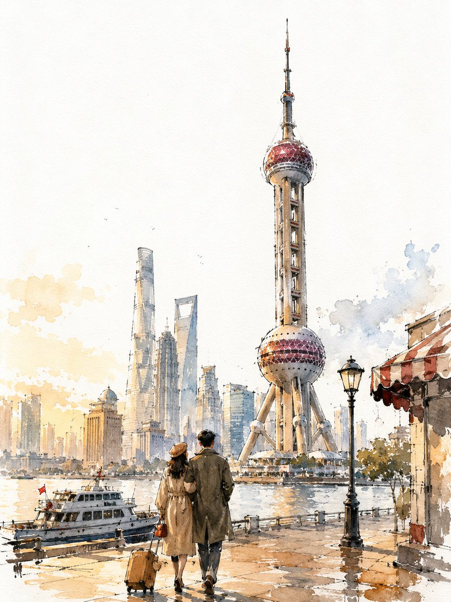
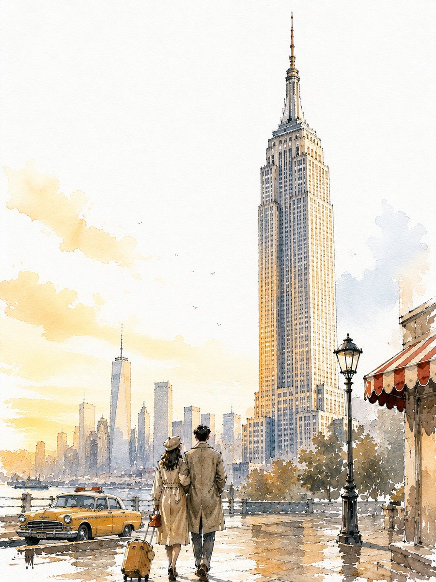
Loose Watercolour Ink Travel Sketch Poster
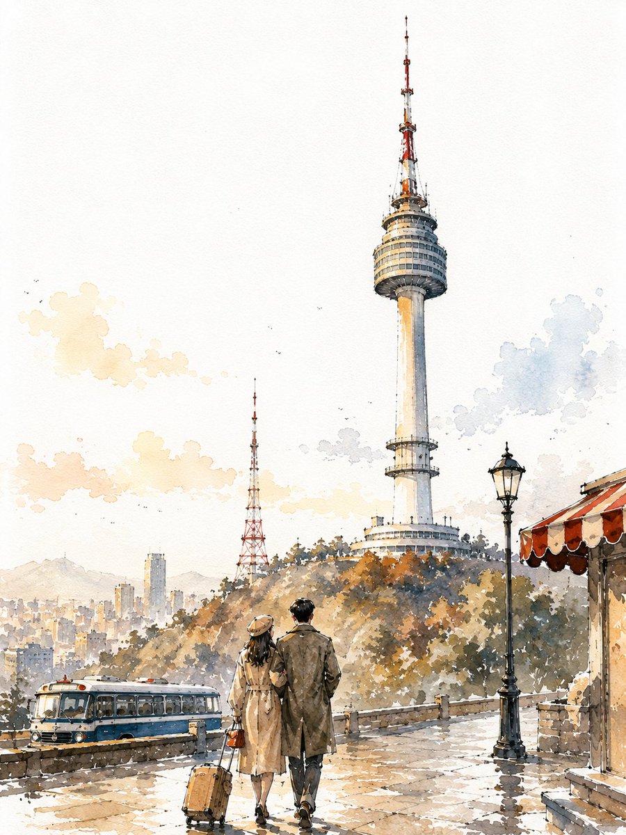
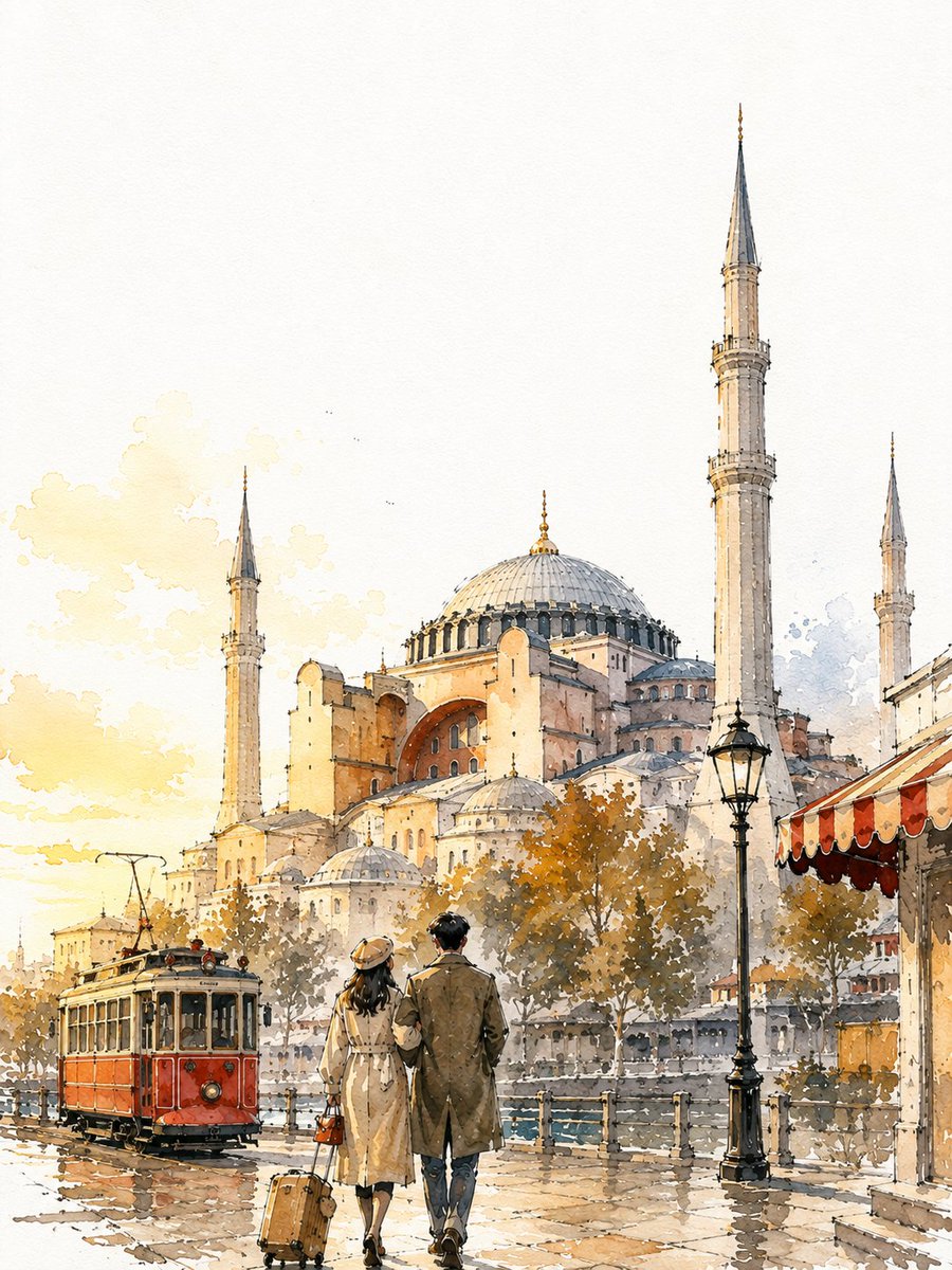
Broken ink contours, wet-in-wet blooms and 55-65% coverage leave bare white paper doing the work, while a couple walks toward the landmark from behind.
Prompt
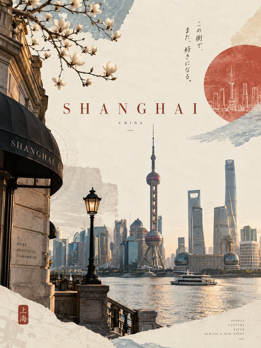
VINTAGE CITY TRAVEL POSTER — [Shanghai], [China] (3:4)
A loose, hand-painted watercolour-and-ink travel sketch of the city, with fast broken lines, uneven washes, generous bare paper and warm golden-hour light. Bright white cold-press paper, no cream or sepia cast.
SUBJECT
Hero: [the Oriental Pearl Tower], viewed from street level, frontal and slightly upward-tilted, full height within the frame, occupying roughly 68-75% of the poster height and positioned on the right third.
Behind it: [the Bund waterfront row], smaller and lower on the left, with two or three soft architectural masses suggesting the surrounding city. Include only the landmarks specified, no unrelated attractions.
IDENTITY LOCK
The primary landmark must remain clearly recognizable through its defining silhouette, proportions, major structural features and distinctive crown, roofline, dome, spire or tower top. These features receive the strongest contrast and must never be cropped or lost into the paper.
COUPLE
A young couple seen from behind, arms linked and walking toward the landmark, one of them looking upward. They occupy 14-18% of the poster height within the bottom 22-25%. Mid-century travel coats, a small handbag and a compact suitcase. Simple silhouettes with minimal strokes. No faces, fingers, detailed clothing folds or extra figures.
LINE
Loose, broken, imperfect ink contours. Lines may skip, overshoot corners, vary in weight or stop before connecting. Background buildings stay highly gestural: simple rooflines, corners and vertical suggestions, never individual windows or bricks. Some forms should exist only as watercolour washes.
WATERCOLOUR
Use irregular, transparent washes rather than solid fills. Show natural blooms, backruns, wet-in-wet bleeding, pooled pigment, dry-brush skips, dissolved edges and subtle paper-grain granulation. Washes may slightly overshoot or fall short of the ink. Keep overall coverage around 55-65%, leaving generous bare paper in the sky, distant city, sunlit surfaces, pavement gaps and outer edges.
VALUE & DEPTH
Add six to ten small dark accents in burnt umber or dark indigo around structural shadows, recessed areas, beneath the vehicle and couple, and near the landmark base. Foreground has the strongest pigment and clearest line. Distant buildings use only 15-25% pigment strength in dusty blue-grey and hazy peach, with almost no linework.
LIGHT & COLOUR
Golden-hour light from the left, creating one illuminated side and one shaded side on the landmark. Palette: warm limestone cream, pale apricot, warm grey, dusty steel blue and soft graphite, with only one saturated city-specific accent colour, [vermillion red].
PROPS — 3 ONLY
One characteristic local vehicle or transport element, one lamp post and one striped awning edge.
TEXT
No text anywhere: no titles, signs, logos, numbers, storefront names or pseudo-lettering. Keep the top 15-18% completely clean for later typography.
AVOID
Photorealism, CGI, 3D rendering, generic AI architecture, duplicated or hybrid landmarks, warped structures, incorrect proportions, repetitive windows, mechanical linework, extra figures, visible faces, flat fills, neon colours, excessive detail, edge-to-edge painting, floating objects, inconsistent scale or garbled text.
Bare paper beats invented detail. RECOGNITION FIRST, VALUE SECOND, ATMOSPHERE THIRD, DETAIL LAST.