Back to Prompt Library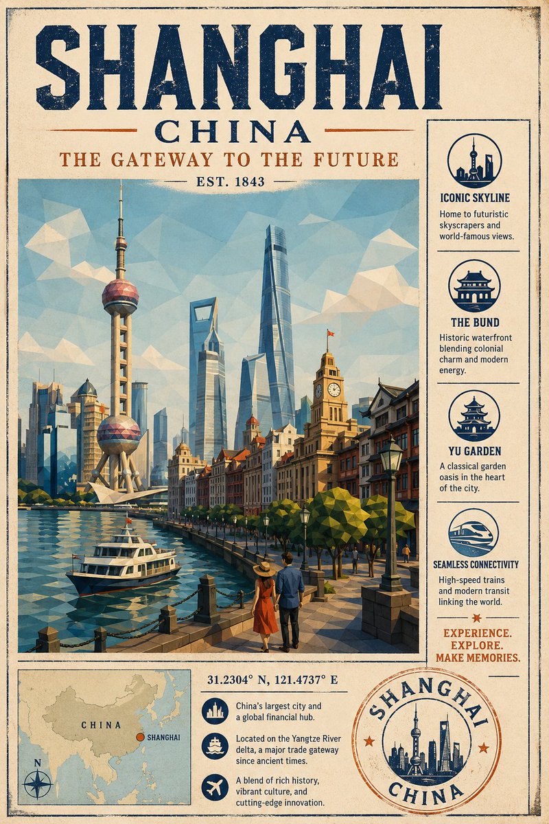
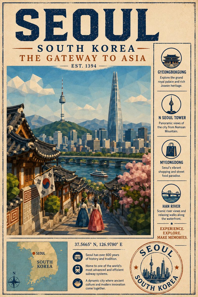
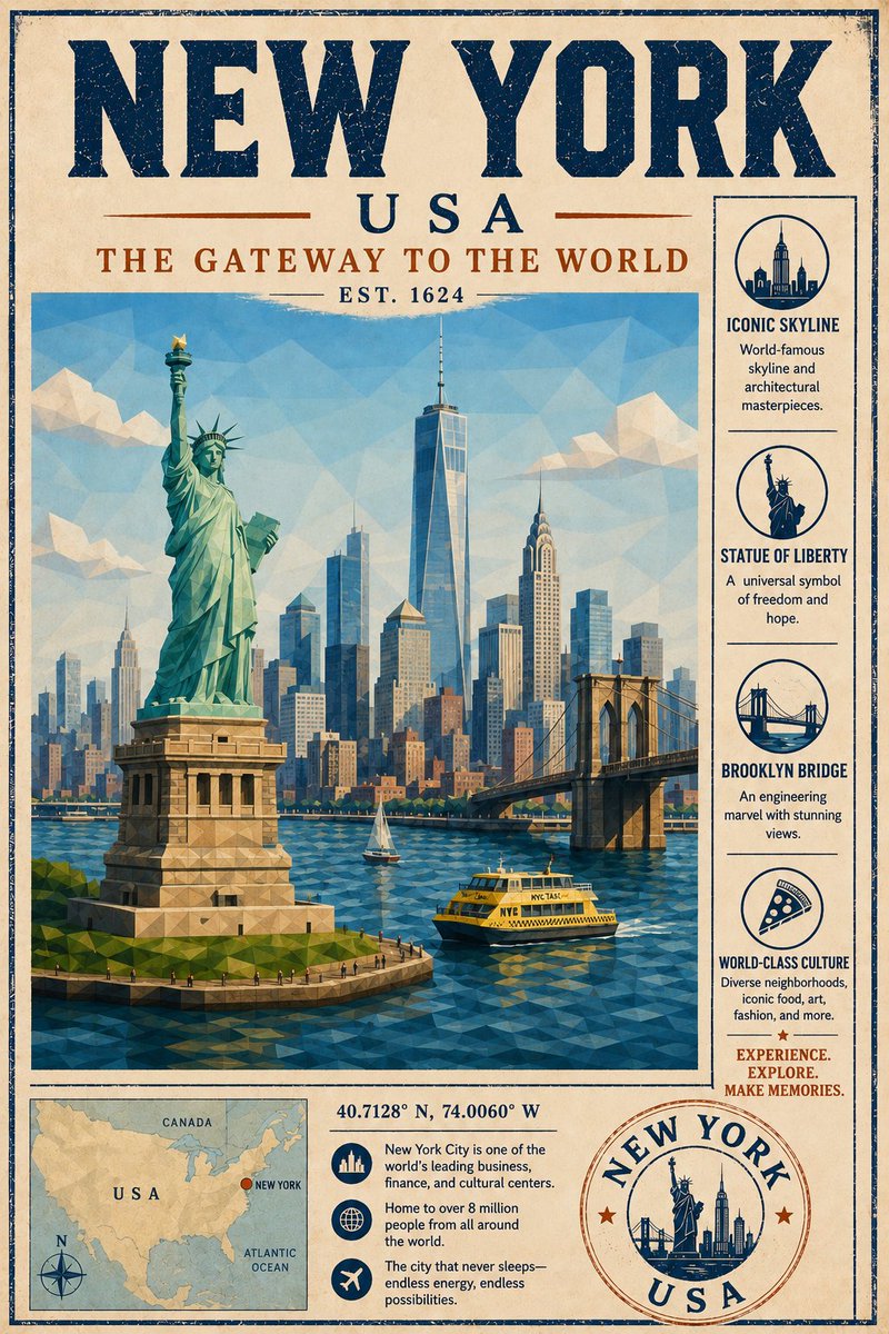
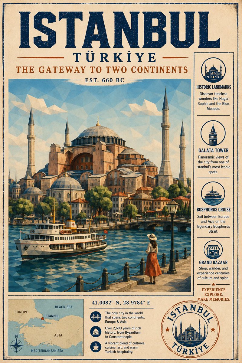
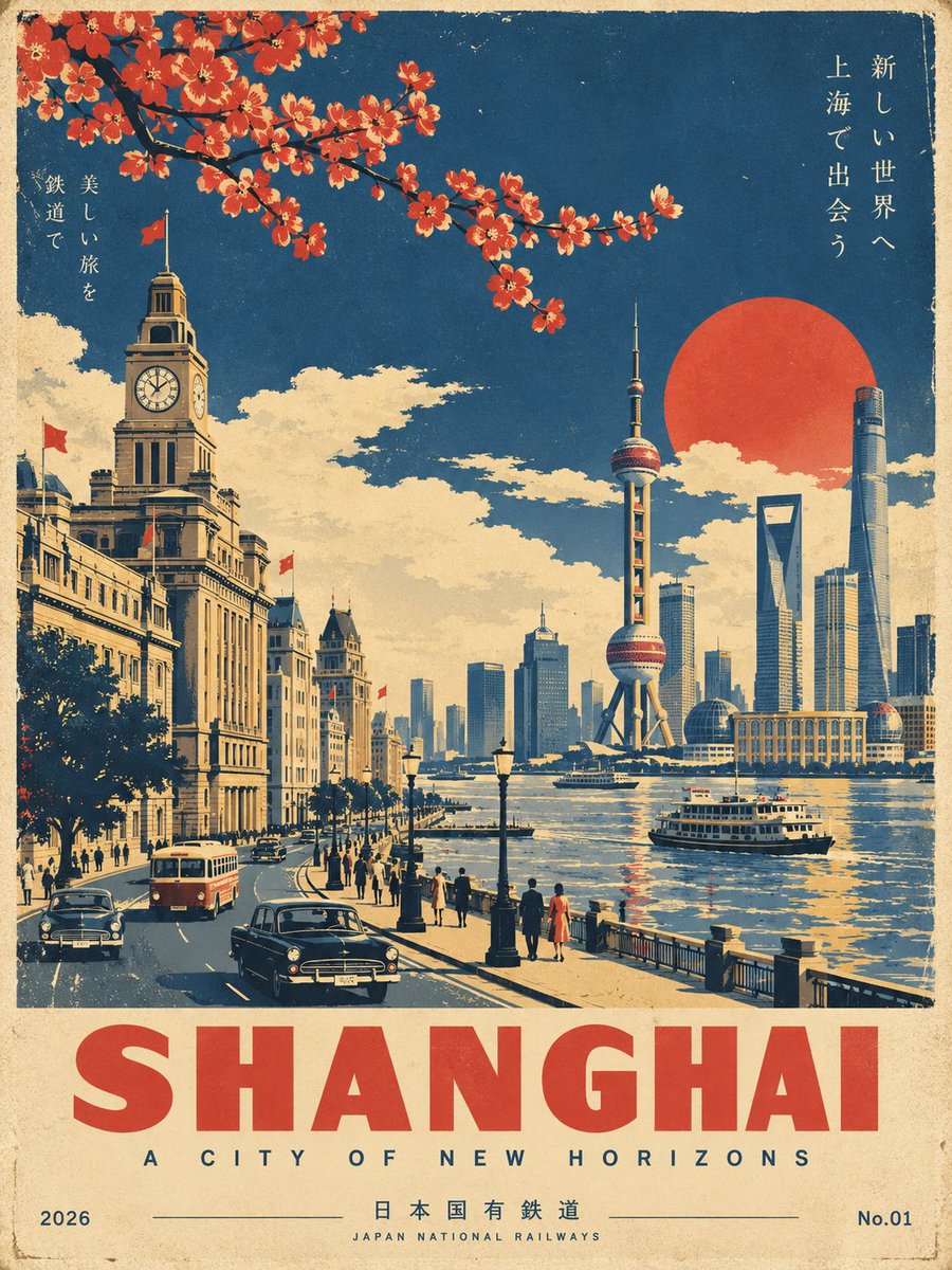
Low Poly Mid-Century Tourism Brochure Poster
Aged cream paper, distressed navy headline type and a faceted low-poly scenic panel, finished with an attraction side panel, mini map and destination badge.
Prompt
Create a refined vintage tourism poster for [Lucerne], combining the visual language of a premium mid-century travel brochure with sophisticated low-poly 3D illustration.
FORMAT & COMPOSITION
Vertical 4:5 poster. Cream / off-white aged-paper background with subtle grain. Strong, balanced editorial composition. Large destination name at the top in bold distressed navy uppercase, with the smaller region name [Switzerland] beneath. Elegant tagline: "THE GATEWAY TO THE ALPS". A small "EST. [1893]" detail where appropriate.
MAIN ILLUSTRATION
Create a large central scenic panel featuring the most iconic and instantly recognizable view of the destination. Use low-poly 3D geometry with clearly visible angular facets, dimensional shading, atmospheric depth, stylized but believable proportions, and natural reflections where water is present. It should feel like a premium illustrated travel poster, not photorealistic CGI.
Include: the iconic landscape, mountain or landmark; recognizable local architecture; a local street, waterfront or village scene; an iconic local transport detail; distinctive trees and vegetation; and one or two small human figures for scale.
VISUAL STYLE
Low-poly 3D landscape, vintage screen-printed travel-poster aesthetic, fine ink-like outlines, subtle watercolour texture and paper grain, clean geometric composition, premium editorial illustration, stylized, sophisticated and believable. No photorealism, no generic fantasy scenery. The destination must be immediately recognizable.
COLOUR PALETTE
A restrained, harmonious palette: cream paper, deep navy, muted sky blue, ice / water blue, natural greens, warm ochre-beige, plus one subtle accent colour, [warm ochre], inspired by the destination.
SIDE INFORMATION PANEL
Add a narrow vertical information panel with four concise attractions, each with a small icon, a name and a short descriptive phrase, plus the inspirational line: "EXPERIENCE. EXPLORE. MAKE MEMORIES."
DESTINATION DETAILS
At the bottom include a small region map with the destination clearly marked, its latitude and longitude, three compact travel facts, and a circular destination badge reading the destination and region names.
TYPOGRAPHY
All visible text in English. Large, highly legible typography, consistent navy headline type, restrained rust-orange accent type, clean professional spacing and hierarchy. Avoid excessive tiny text and never invent incorrect non-English lettering.
Overall goal: a collectible, premium mid-century tourism poster that feels authentic, sophisticated and geographically recognizable, seamlessly combining vintage print design with polished low-poly 3D illustration.